Personal concept project
Android Automotive
Every element has to survive a two-second glance at 70 mph.
A personalized, distraction-free digital cockpit built to Android Automotive design standards.
Tools · Figma · Photoshop
01
What this is
A self-directed concept: a full UX/UI system for an Android Automotive head unit, designed to the platform’s own driving-safety standards rather than to a client brief. No production constraints — the point was to design against a strict bar and see what the interface had to give up to clear it.
- Role
- UI/UX Designer
- Tools
- Figma, Photoshop
- Context
- Personal concept · Android Automotive standards
- Target users
- Drivers 18–65 · daily commute & long-distance
02
Screens that make you look away
Most in-car infotainment is cluttered, slow, and unintuitive. Deep menus, sluggish touch response, and rigid customization all push the driver to spend longer looking at the screen than the road — which is a safety problem before it’s a usability one.
The response was a digital cockpit that carries high-density information at low cognitive cost: the controls a driver reaches for constantly are always one tap away, touch targets are sized for a moving vehicle, and the layout is modular so each driver pins what matters to them and hides the rest. Dense where it needs to be, silent everywhere else.
03
Three decisions that shaped it
- 01
Simplified menus
High-frequency driving controls — climate, routing, media — sit on the surface. Everything else is one deliberate level down, out of the glance path.
- 02
Modular grid & widgets
Customizable widgets let a driver pin the apps, quick dials, and vehicle-status controls they actually use, and drop the ones they don’t.
- 03
Multimodal safety
Enlarged touch targets, high-contrast type, and quick-glance status indicators — built so a driver can read state without reading text.
Screen 01
Dynamic welcome dashboard
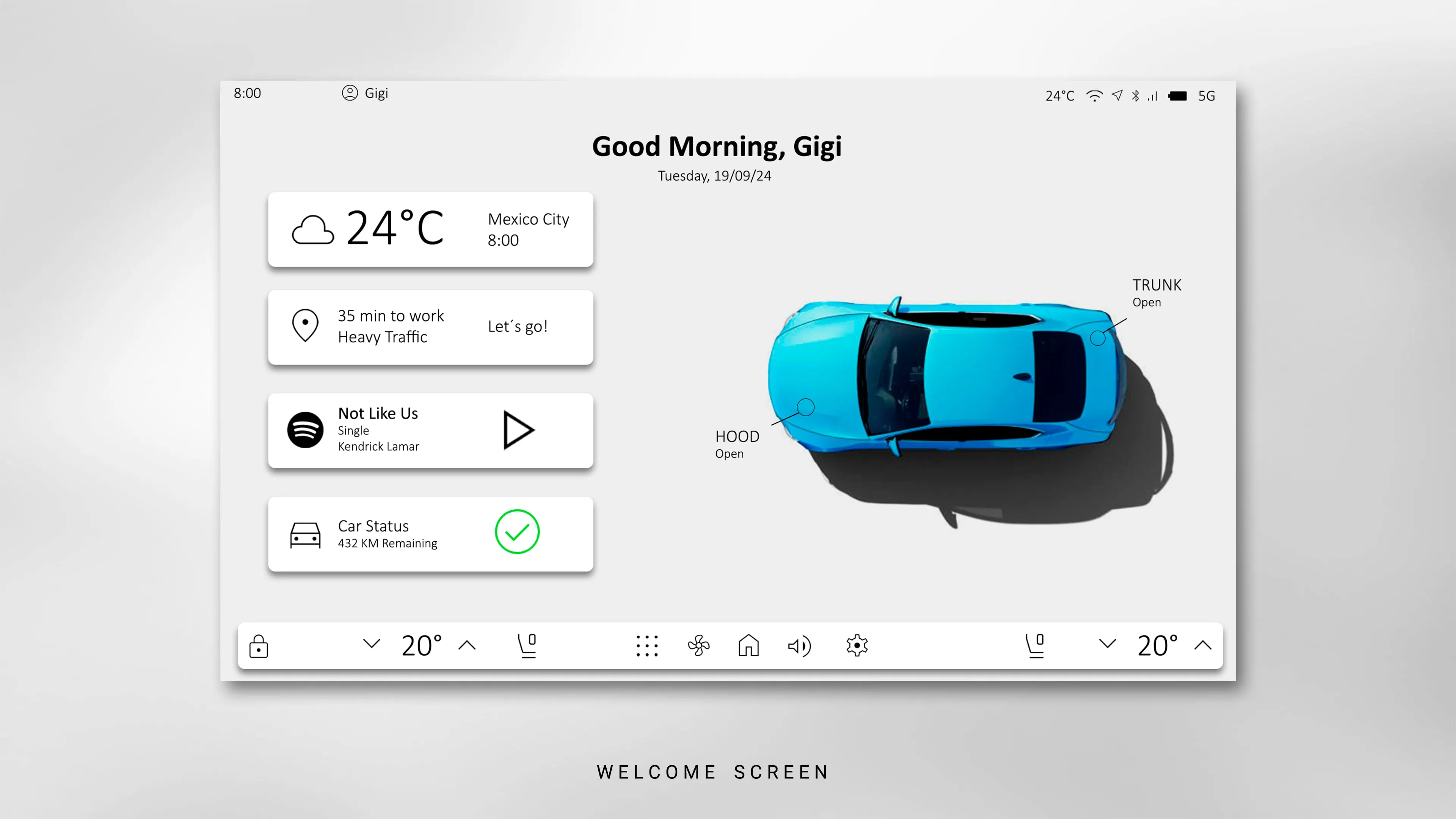
The screen you meet first. A contextual greeting, live weather, the commute time to a known destination, battery range, and a top-down 3D render of the car that surfaces physical status — a hood or trunk left open shows up here before you pull away.
Screen 02
Split-view navigation
Route mapping stays persistent and full-height on the right. Secondary widgets — Spotify controls, phone charging status, favourites — stack on the left rail and overlay without ever taking the map away. The driver never switches modes mid-route to change a song or check a call.
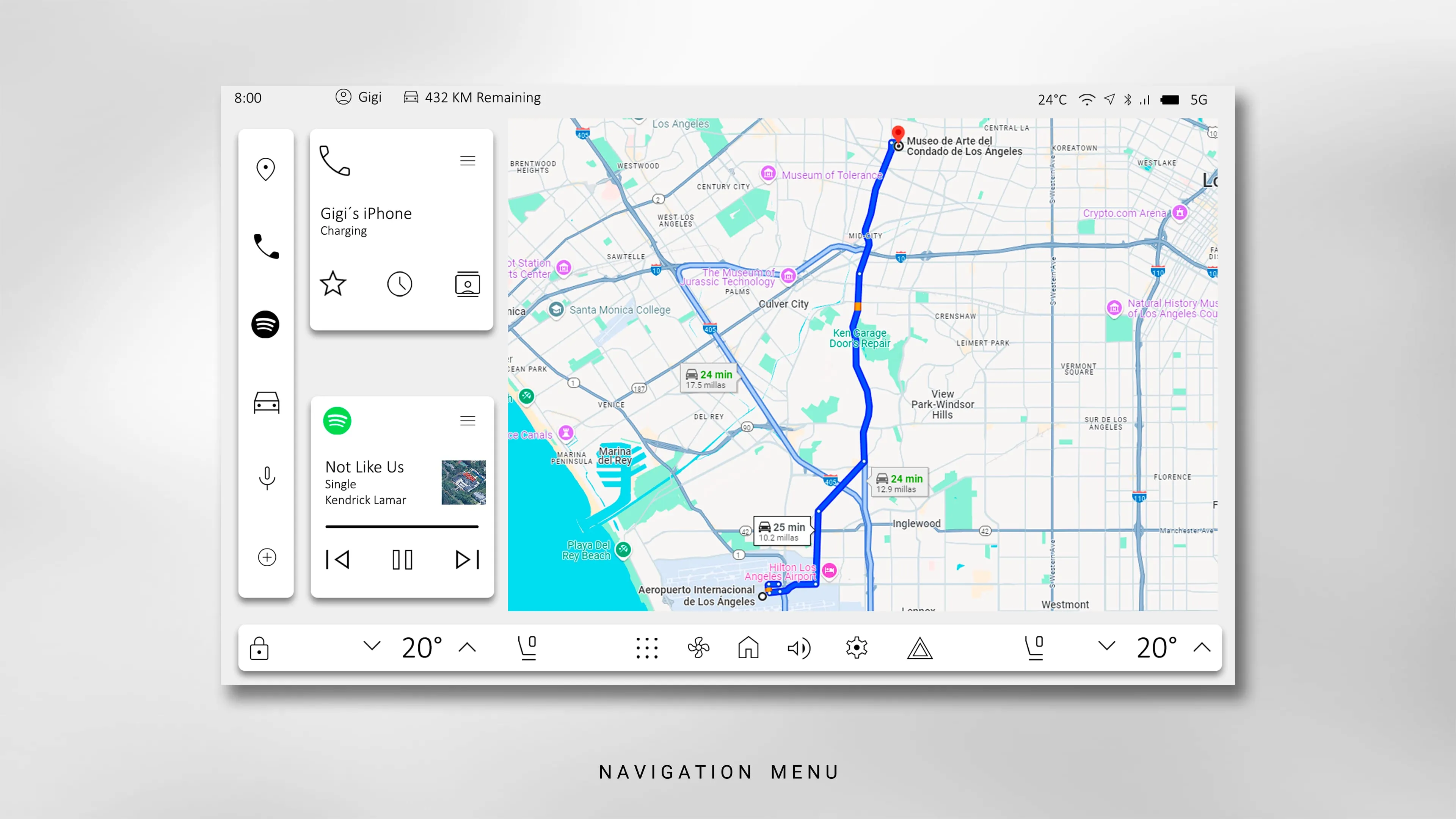
Left rail — compact widgets over a persistent map
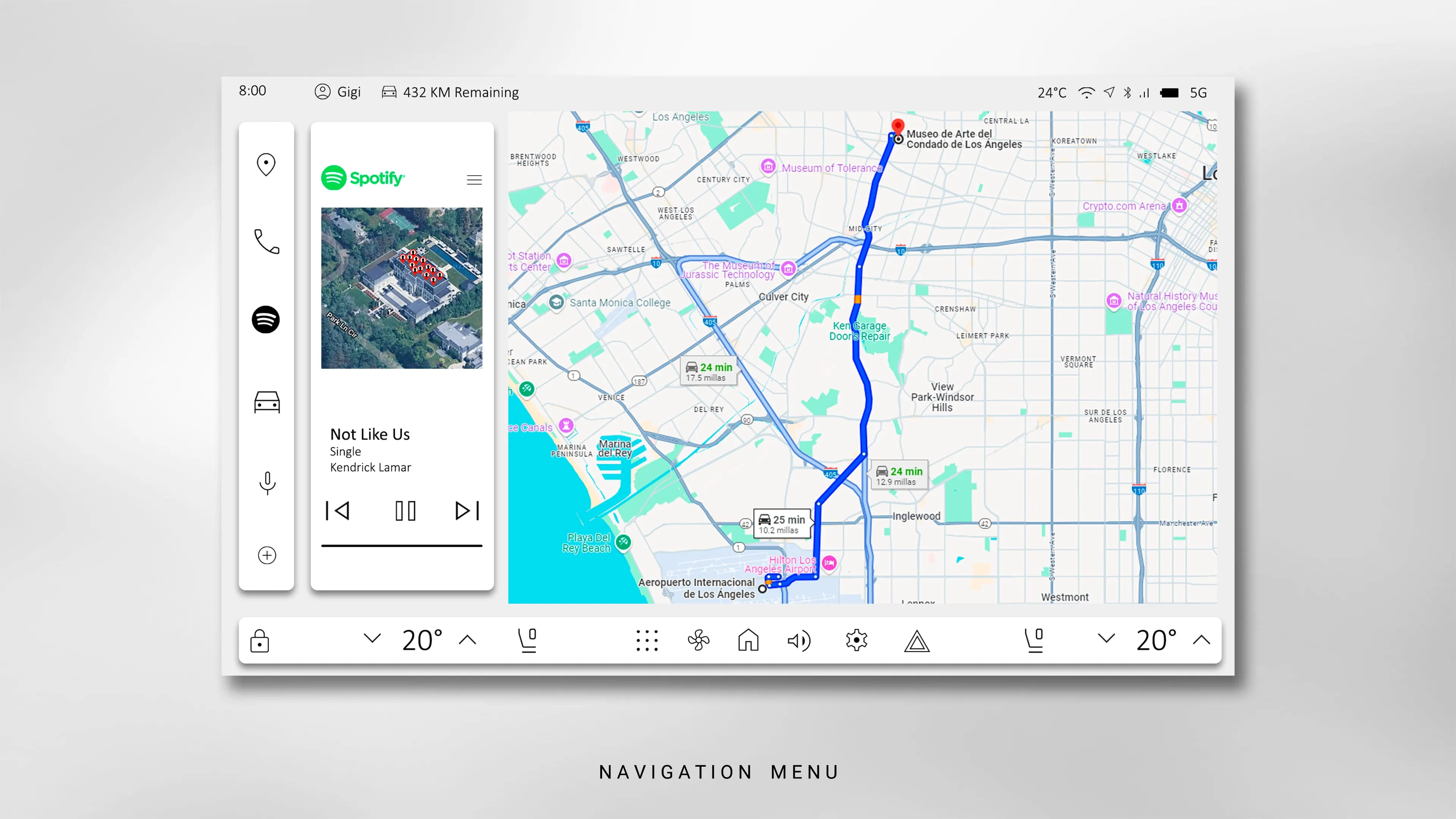
Same layout — a widget expanded in place, map untouched
Screen 03
In-car media
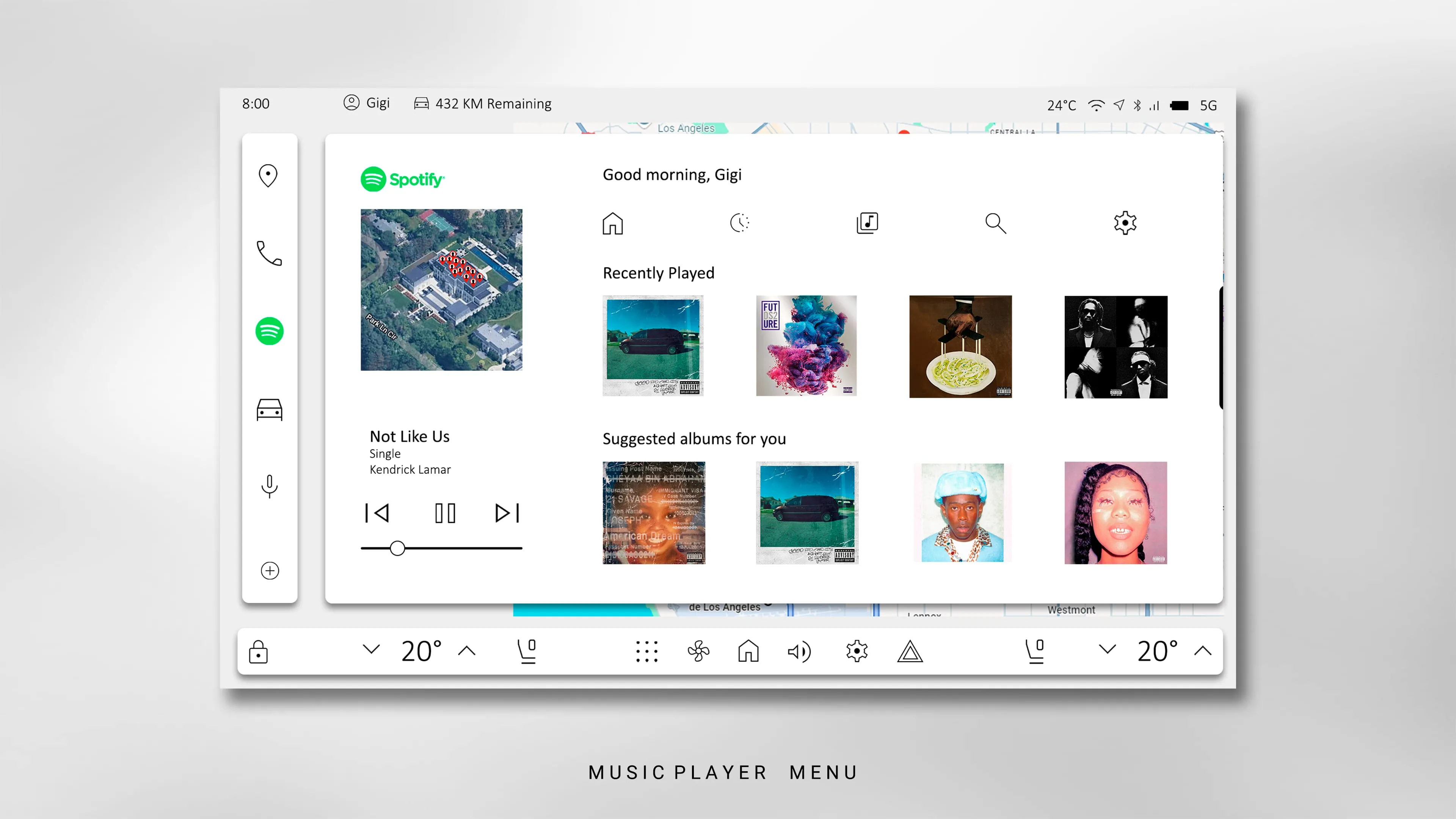
The Spotify surface opens as a full overlay but keeps the left rail and the persistent climate bar. Album art is large, browsing is coarse-grained on purpose, and playback controls are sized to be hit without aiming. Type is set for glanceability, not density.
Screen 04
The structure underneath
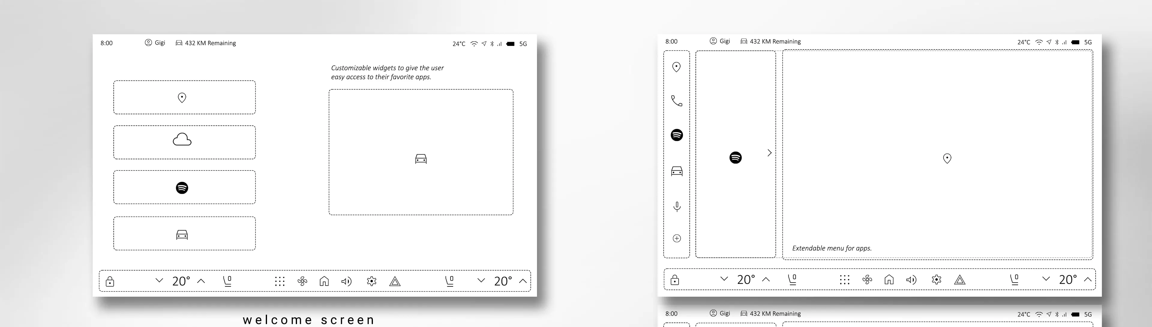
Before any of the finished screens, the system is a set of rules: how the widget dock expands and collapses, why the climate bar is always docked to the bottom edge, and how the navigation drawer opens without displacing the map. The wireframes are where the two-second bar was actually enforced.
Reflection
Designing for the drive
Designing for a car screen means shifting the focus from visual novelty to immediate cognitive readability. Every pixel, every button placement, every hierarchy decision has to pass the same test: can a driver take what they need from it in a two-second glance and get their eyes back on the road?
- The safety bar is the design tool. Once “two-second glance” is the constraint, most layout decisions make themselves — density goes where attention is cheap, everything else gets quieter.
- Modularity beats a single “right” layout. A commuter and a road-tripper want different things on the surface. The system’s job is to make pinning and hiding trivial, not to guess.
- The dashboard should answer questions you haven’t asked yet. Hood open, low range, heavy traffic on the usual route — surfacing these on arrival is worth more than any amount of menu polish.